How to Create a Timeline
Smartsheet makes it easy to create rich, visual project timelines with two powerful integrations. You can connect your Smartsheet data with Office Timeline or Tableau, and create beautiful visual representations of your project plans.
Make Beautiful Project Plans with Office Timeline
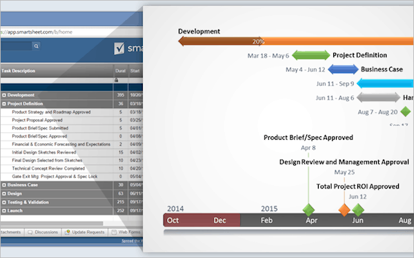
With the Smartsheet and Office Timeline integration, you can visually display and highlight the most important parts of your plan in a timeline. Use filters to weed out unnecessary data, customize your presentation with colors and shapes, and easily share with others as an image, pdf, or PowerPoint slide.
Here’s how:
- Select a Smartsheet template with Gantt chart capabilities.
- Add your own information to the Smartsheet template.
- Download and install the free version of Office Timeline from www.officetimeline.com
- Launch PowerPoint and navigate to the Office Timeline tab on the ribbon.
- Click on New dropdown and select Import from Smartsheet to create your first visual timeline.
Click here to learn more about making a project timeline with Office Timeline.
Create Interactive, Visual Timelines with Tableau
Deliver powerful analysis and insight by integrating Smartsheet data into Tableau. The Smartsheet Live Data Connector establishes a real-time connection between Smartsheet and Tableau, allowing you to create live visualizations that you can share with anyone.
Here’s how:
- Install and configure the Smartsheet Live Data Connector by following the detailed instructions here.
- Link your Smartsheet data with Tableau by using the Live Data Connector.
- Design and configure your report in Tableau.
- Use Tableau Dashboards to create a compelling visual timeline of the data.
Click here to learn more about making a timeline with Tableau.
Common Uses for Timelines
Timelines are useful across all industries. From historical events to business scenarios, they help you visualize complex information in a digestible, easy-to-understand way.
Here are some common timeline uses:
Teachers and Students

Timelines have become an important part of the classroom as they allow students to actively participate in the learning process. They help students easily understand and memorize events and dates, and visualize the order of historical events or trends.
Project Managers

When managing a project, timelines are used to help team members visually track projects and see how tasks relate to each other. A Gantt chart is one of the most popular timeline views used by project managers. With a Gantt chart, you can plan out all of your tasks, so complex projects are easy to manage and organize.
Business Analysts

Analysts uncover and sift through huge amounts of complex data. To better identify trends and patterns, and present them in an digestible, many analysts turn to timelines, especially interactive timelines. They also use timelines to map out the start to finish portion of an analyst project, creating a sort of analyst calendar.
Historians

Timelines are especially useful for studying history, as they depict a sense of change over time and can quickly display the chronology of events. They also show what happened when and how much time passed between events. Wars, social movements, and biographies are often shown as timelines.
Different Types of Timelines
Horizontal to vertical, and interactive to static, there are many kinds of timeline makers you can choose from.
How do you know which timeline is best for you? First, you must consider the data you are trying to visualize. Are you showing growth over time? Are the events in a strict chronological order? In most cases, the data will dictate the timeline for you.
Here are the different types of online timeline makers:
Gantt Chart Timeline
A Gantt chart, or horizontal bar chart, is a timeline view to visualize how a project is tracking. You can see all your project tasks and how they relate to each other over time in a cascading horizontal bar chart. This is the perfect timeline for managing projects, both big and small, when you need to coordinate tasks, dates, duration, and resources. For more information on Gantt charts, click here.
Vertical Bar Chart Timeline

A vertical bar chart is useful to track time against amounts, such as a timeline that measures growth or money raised for a cause or event. As time passes, the vertical bars go up (or grow taller) as the monetary amounts increase on the y-axis. This upward motion helps quickly visualize the gain. Business analysts or finance teams find the most value in this type of timeline.
Chronology Chart

This type of timeline visualizes events in a specific order of succession over time. Timeline events included in a chronology chart must follow a strict order, and typically start with the earliest event on the left of the x-axis and the latest event on the right in a horizontal layout. A chronology chart is most effective when displaying historical events.
Static Timeline

A vertical bar chart timeline and a chronology chart are both static timelines, meaning that the information does not move or change. Data is revealed all at once and there is no ability to “drill down” or analyze an entry to get more detail.
Interactive Timeline

Click here to view the interactive timeline. Credit: Robert Rouse
An interactive timeline, or a dynamic timeline, is a chart that you can move through, scroll, or change the data set in real time. It allows you to interact or play with complex data to uncover new insights. Choose a scrollable, interactive timeline if you have a project that spans many months. A dynamic timeline is best for large amounts of data that you want to analyze to identify trends and patterns.
Other types of timelines include a flag chart timeline, a scatter chart timeline, and a branch timeline.
Timeline Templates
Begin your project with one of these pre-built timeline templates. Display tasks visually as bars in a timeline with a Gantt chart. Get a picture of the duration, as well as the start and finish date of your project's tasks. Set up automatic notifications to alert you of upcoming dates.
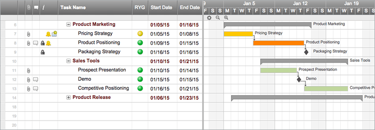
Simple Project with Gantt Timeline
This template is designed for simple project plans with tasks, sub-tasks, and a Gantt chart timeline view. Your team can easily update progress, track deliverables, and check status from anywhere.
Try this Smartsheet Template
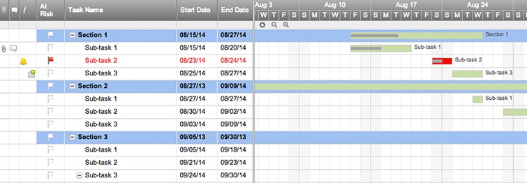
Basic Project Timeline with Gantt and Dependencies
This sheet helps you manage your project and provides an easy-to-understand visual Gantt timeline for your team and clients. Update tasks, manage dependencies, track progress, and store project files -- all in one place.

Try this Smartsheet Template
Gantt Project with Hard Deadline
If your project has a firm deadline, use this timeline template to help you work backwards to determine start dates for preceding tasks. It's a huge time-saver when planning launches, events, or other projects with strict deadlines.
